All posts by Gavin Fabiani-Laymond

Unknown's avatar

About Gavin Fabiani-Laymond

President, CEO & Editor of https://gavinsgadgets.com Reviews & News of Technology

Yahoo and Dropbox join services to challenge Gmail and Google Drive

Dropbox and Yahoo! announced that they will be integrating their services to offer seamless file attachments in the Yahoo! Mail Android app. This is to challenge what Google offers with Gmail and Google Drive. Users that authenticate with their Dropbox account from within the Yahoo! Mail app will now be able to select either local or Dropbox files from the “attach” menu, and simply send out files that are stored in the cloud.

The update should appear soon in the Google Play store for the Yahoo Mail app.

As sales fall, Blackberry starts firing its staff and director

According to The Wall Street Journal, Richard Piasentin, the embattled smartphone maker’s US managing director, has been fired and a large number of layoffs are being planned as well.

This doesn’t bode well, and I sincerely hope this is just part of the turnaround and not demise of Blackberry.

iOS 7 Beta 3 now available – changes

Apple released its third beta for iOS 7. This features a number of changes, many of which are slight cosmetic changes including –

– Mail has tweaked search bar
– Music controls are slightly redesigned
– Clock icon in control centre is tweaked
– Weather app has had a change to the fonts
– Safari has seen some notable UI enhancements for the tab/bookmarks via on the iPad, in the loading bar for iPad/iPhone, and in Private Browsing mode.
– Calendar now shows which days you have events on
– Time on Lock Screen while playing music.
– Tweaked interface when clicking a key in Calculator.app
– Slight Game Center UI tweaks.
– Tweaked UI for wallpaper chooser.
– New silent control in iPad Control Center
– New app icon loading UI for download apps:
– Slightly tweaked pull-to-refresh animation in Mail app.
– New App Store tab buttons.
– Siri is much faster to navigate.
– Nice new UI for arranging tab-bar icons
– Yellow selection UI in notes
– New animation while accessing Spotlight
– Various font changes all over.
– Perhaps an even more improved voice in Siri
– Some transparencies removed from iPhone 4S (particularly in Siri)
– Some UI button tweaks in iTunes Radio
– Dictionary feature is now active:

I’m sure there are more tweaks along with tons of bug fixes. All in all, iOS 7 is shaping up to be something excellent.

What do you think?

Ten minutes with the Nokia Lumia 925

Yesterday I decided to take refuge from the heatwave in the South West of England in my local Apple store and Carphonewarehouse, as you do 🙂

In terms of air conditioning the Apple store was super cool inside, apart from any tech of course.

So my venture into the Apple store was a short affair, just buying another Apple TV remote to replace the one damage by one of our labradors. So off to CPW to check out what goodies they had in store. I was keen to see the Nokia Lumia 925. Luckily they had one in a greyish finish.

First up, it looked rather nice with a sort of uniformed rectangular look and curved sides. Holding it in the hand was comfortable due to the curved sides. The screen and overall phone size felt good to , that is not too small and not too big. I personally like the windows operating system and was able to manage when I had the Lumia 620 using the available apps. Gaming apps needed a larger selection Anyway, back to the 925. I liked the grey finish and moving between apps and menus is a typical windows phone affair. The 925 was very fluid and produced a good first impression. The reason I was interested in this phone is its camera, which is excellent.

However, I wish it had more than 16gb memory. I gather Vodafone currently has the exclusive on the 32gb model. The photos I snapped in the store looked rather good. Obviously, the 925’s low light skills working well.

Overall, I was quite pleased with the 925.

30 minutes with the Samsung Mega

That’s right. You will have read, or will read I spent 10 minutes with the Nokia Lumia 925, but 3 times the time with the Samsung Mega.

So let me start by saying this phone is absolutely HUGE HUGE HUGE and HUGE. It makes the Samsung Galaxy Note seem small, the Samsung Galaxy S4 pint sized and the iPhone 5 a dinky toy. The Mega comes with a whopping 6.3 inch screen versus the iPhone 5 which is 4 inches.

First up, I loved the large form factor. Using the S-Planner app the month view on the Calendar displayed so beautifully. Everything from lists, photos , in fact any app just looked so clear on the big display. It also felt okay in the hand and I wouldnt have a problem making phone calls with it. For long phone calls, a Bluetooth headset may be a better option. In terms of styling it followed the Samsung look, so was durable plastic. Unlike the Note that has a stylus, this phone doesn’t.

I spent a lot of time trying out all the various functions and came away with one thought. Why didn’t Samsung include some proper specifications. This large slab has only 8gb of memory and then has many other features reduced. Shame.

I can see the Sony Z Ultra fitting well in my hand which has a 6.44 inch screen, now that I have seen and held the Mega. 

LG G2 launch date is 9th August but why wait – photos revealed

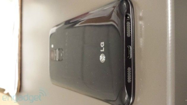
Engadget published leaked photos of the LG G2, the upcoming flagship smartphone from LG. It is a monster powerhouse with all the latest specs.

lg1

As you can see it looks very similar to the LG Nexus 4, although somewhat slimmer. Rather unusual is the volume button arrangement on the rear instead of the side edges.

lg2

Also fairly obvious from the photos is the ultra thin bezel.

From these pictures, the LG G2 should features 2gb ram, 32gb internal memory plus micro sd card expansion, Snapdragon 800 processor running at 2.3 Ghz, 5.2 inch 1080p screen. In other words a computer in your pocket.

My only concern is what is LG’s Unique Selling Point. All phones look similar nowadays so its needs something different.

Twitter receives cross platform app updates and via the web too

Twitter announced on its blog that it had made changes to its apps across android, iOS and the mac and web to provide a better unified look and direct message syncing.

So now if you read a direct message on your iPhone it will show read on your android tablet or vice versa. Search has been improved too, and the iOS app has finally caught up with the android app and offers tweet composer for better new tweet operation.

However, the tablet design on android is still the phone version and looks terrible. Your tweets aren’t sync across timelines.

I did notice that the android app has had a few cosmetic tweaks and changing the notification sound now works.

So what else would you like the official twitter app to offer?

Vodafone simplifies its calling plans – treats customers like idiots and rips them off

This caught my eye yesterday and is a good example of a large corporate company treating its customers unfairly.

Headlined: “Pay as you go pricing just got simpler,” the message said: “Pay by the minute – and always know how much credit you have left. Calls on Pay as you go are getting simpler from 1 August 2013. No more complicated pricing by the second – just clear, straightforward per minute charges.”

So if a call is one minute and 37 seconds long, you will be charged as two minutes. “That way, you’ll always know exactly how many minutes you have left.”

The change affects calls to UK and international landlines and mobiles.

Just in case you can’t work the maths, a call lasting 62 seconds that currently costs 26p will, from 1 August, cost 50p – an increase of 92%.

Nothing simple about this new idea, just one way to rake more money in, and affect those that can least afford the increases.