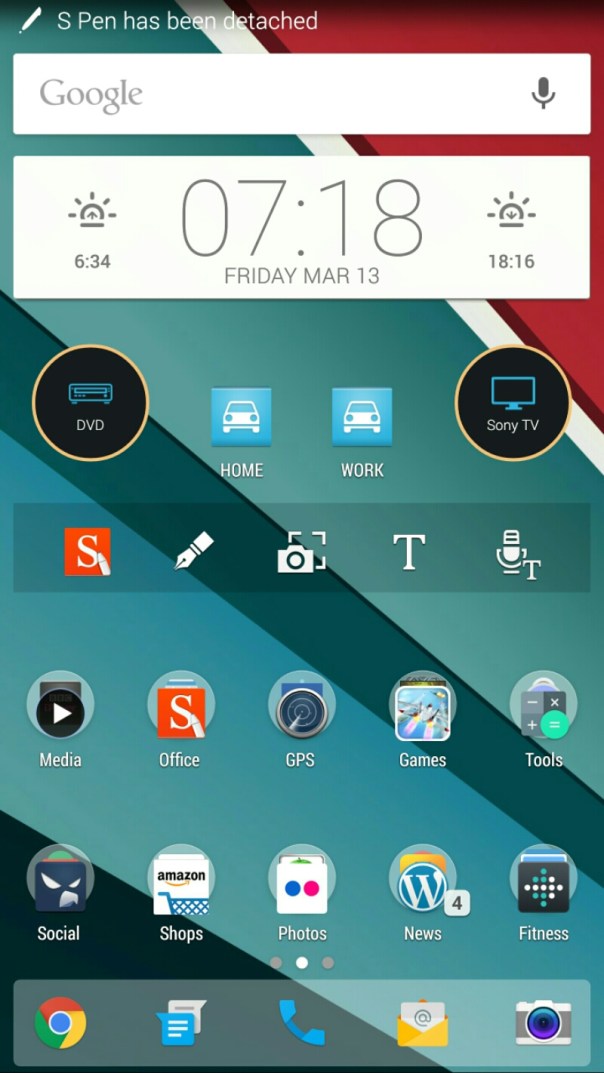
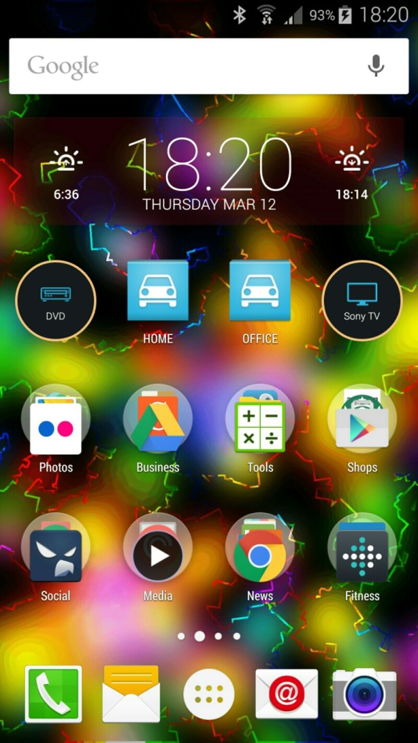
Screen shot of the Google Now Launcher on the Samsung Note 4.
First up you get enlarged icons and only 4 icons per row except bottom row. Then there is loads of spacing. Swiping to the left reveals the Google Now cards.
So what’s your view. Out of place or ok or something else.
Reason for doing this was simply that I got bored with Nova and Apex Launcher.
Update – reset up Nova from scratch. So which do you prefer. Nova below.


Really like my note 4 but touch wiz and Google launchers are too fixed… I use nova and with that 5.7″ screen can make better use of the screen realestate by adjusting the icon grid to give me 5 wide by 6/7 long….
LikeLike
Just updated with a Nova screen shot. Assume you prefer Nova version
LikeLike