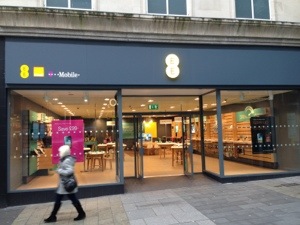
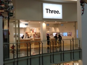
About a week ago I was debating on twitter the appeal of bricks and mortar phone stores. Two companies have recently had rebranding and refitted their store, Three and EE. Now EE store uses a grey base and some yellow. It creates a please don’t enter appeal with nausea feelings. And then there is Three. It’s a clean and fresh look. Modern and vibrant and very appealing. Don’t believe me, well have a look at the photos below and you decide. I look forward to your comments 🙂